
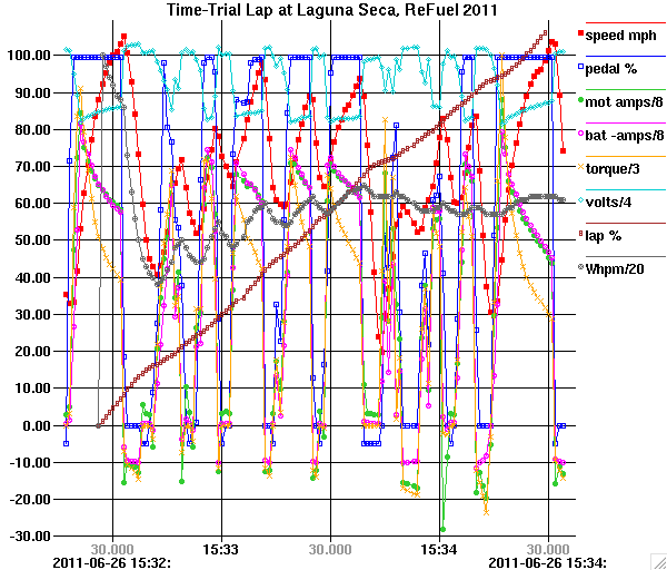
Another software project I've been working on recently (timesharing computer time with OVMS) is a little data graphing program named "graf" for use in X11 environments. It's one that I've used for work and personal data exploration over the past couple of decades, but recently I added several enhancements. It is quite lightweight, using only the base Xlib library and protocol, so it can display large datasets without choking. You folks may have your own favorite fancy graphing tools; this one has a somewhat different purpose than most. It is designed for data exploration more than presentation, using mouse functions to measure the distance between points or the slope of a line or calculate the least-squares regression line for a dataset or to zoom in on a section of the graph for a closer view. It takes a simple text file as input with an (x,y) pair of numbers on each line so it is easy to feed it with the output of a script, or it will accept multiple files as input to show each as a separate line on the graph. One unusual feature that was part of the recent enhancements is the ability to interpret Unix-style timestamps (based at 1970-01-01 00:00:00 GMT) as dates and times and to generate dynamic grid labels with varying temporal resolution depending upon what unit boundary the grid line represents. The motivation for varying the resolution is that to show a complete date and time down to microseconds takes too many characters to fit on each grid line. Each grid line label on the X axis shows the increment of time at the scale that allows the labels to fit, while at the left and right edges an additional label shows the remaining date and time information not included in the grid line labels. The format of the labels will vary to show a larger scale value on the even boundaries and as you zoom in the detail changes. Examples: 09/01 2014 03/01 06/01 09/01 2013 2014 22:30 23:00 23:30 04/26 00:30 01:00 2014-04-25 2014-04-26 45.000 50.000 55.000 23:56 05.000 10.000 15.000 20.000 25.000 2014-04-25 23:55: 2014-04-25 23:56: Although this varying format is not common, I think it is a pretty neat idea. In the actual graph window I use three levels of gray for the grid labels so the major boundaries are emphasized. And in local time, the DST transitions are handled properly (that was a challenge) by varying the grid spacing if needed. If you have an X11-Unix-ish environment and would like to try it out, the source is here (build it with ./configure then make): https://github.com/kernelsid/graf Or, I have MacOS and linux (CentOS) binaries here: http://casners.us/macos/graf http://casners.us/linxu/graf Try "graf -h" to see the usage text and Ctrl-H, ? or F1 in the window when running to pop up another window describing the mouse and keyboard functions. A three-button mouse or simulation thereof is needed to access the functions on the middle button. I've attached two data files that you could try along with a third that you could download since it is bigger than I want to put in email: 1) The first graph has a bunch of data lines for all the telemetry parameters collected from my Tesla Roadster log while driving on the track at Laguna Seca in the time trial event at ReFuel 2011. 2) The second dataset contains timestamps with fractional second resolution. This produces a graph of the difference between the internal-clock-based timestamps contained in the datastream generated by the little 8-pin PIC microcontroller that I used to extract the data from the two meters on our home solar PV system and NTP-derived timestamps in the computer that collects the datastream. The latter timestamps only have a resolution of one second, hence the +/-500ms noise. This is a good dataset for testing the linear regression function. 3) The third graph shows the output of the solar PV system on our home for a period of 7 days as measured in Amps as displayed on the meters connected to the left and right strings of panels in our system. This dataset demonstrates graf's speed since it contains 1.2 million datapoints, but that means the file is 49MB so rather than attaching it to this email I have it available for download from: http://casners.us/amps.graf If you want to run graf with these datasets, I suggest invoking it with "graf -Lmt" plus the dataset filename to select the X axis date display in local time and to show a small icon at each datapoint. I usually also include -t because I prefer just tickmarks rather than full grid lines most of the time. I also attached a screenshot of the first graph so you can at least see a static image if you don't want to try to run the program. -- Steve